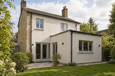
Wollaton exterior walls
Testing render colour and grain on the actual elevation
A render sample is most useful when it answers a real decision. That might be whether a pale colour suits the brick, whether a grain looks too coarse beside new windows or whether a repair will sit comfortably with retained work. A handful of small swatches can narrow the choice, but the final comparison needs to relate to the material, location and viewing distance of the actual elevation.

On this page
Choose the question before making the sample
Begin with the parts of the house that will remain. Roof tiles, brick, stone, frames and doors all influence how a render colour is perceived. Photograph them together from the normal approach to the property. Decide whether the new finish should blend with that group or provide a deliberate contrast. This gives the sample exercise a purpose beyond finding a shade that looks pleasant on its own.
Separate colour from texture. A fine-grained and a coarser finish in similar colours can look different because their surfaces catch light differently. If both are still under consideration, label them as separate material options. Do not assume a painted card demonstrates the appearance of a textured coat. The sample should use a method that represents the proposed finish closely enough for the decision being made.
For a local repair, the question may be how much difference is acceptable beside the aged surface. For a whole elevation, it may be how the finish works with retained brick on the adjoining face. These require different comparisons. Put the sample beside the relevant material rather than in the most convenient empty corner. Where a sample cannot safely be applied to the building, discuss a suitable representative panel.
Keep the shortlist small. Several well-chosen candidates with clear labels are easier to judge than a wall covered in subtly different patches. If every option seems wrong, revisit the intended relationship with the existing materials before ordering more samples. A design decision is difficult to resolve through endless swatches when the underlying aim remains unclear.
Make the sample relevant to the specified system
The contractor should identify the product, colour reference, texture and background used for the sample. Where a base system affects the appearance or application, include it in the comparison as appropriate. A thin decorative finish applied to an unrelated board may not demonstrate every aspect of the completed wall. Ask what the sample can reliably show and what will still depend on the actual background and detailing.
Silicone rendering and monocouche rendering are different approaches, so their samples should be understood in the context of their complete specifications. Choosing between them solely from a similar shade overlooks preparation, build-up and finishing method. Compare the practical requirements as well as the appearance, then record which system the accepted sample represents.
Allow the sample to reach the condition in which it should be assessed. Fresh or wet material can look different from the finished surface. Follow the manufacturer’s guidance about application and curing rather than rushing the decision on the day the panel is made. If a sample is damaged or contaminated while other work continues, replace or reassess it rather than treating it as a reliable colour reference indefinitely.
Include a relevant edge or detail when the appearance depends on it. A return around a corner, a reveal or a retained brick band can reveal issues that a flat square does not show. The sample is not a substitute for the technical drawing, but it can help confirm that the specified detail produces the intended visual result.

| Field | Example of the information needed |
|---|---|
| Purpose | Colour beside retained brick; texture around a new window |
| Material | Named system and decorative product |
| Reference | Colour code and grain or finishing method |
| Location | Elevation or representative panel position |
| Assessment | Date, viewing conditions and agreed observations |
| Decision | Accepted sample and elevations to which it applies |
View the sample as a visitor would see the house
Stand at the entrance, the pavement and other normal viewpoints. A surface that looks busy from close range may read more quietly across a broad elevation, while a subtle change in plane can become obvious from an oblique angle. Inspect both close detail and overall effect. Neither viewpoint alone tells the whole story of how the finished wall will appear.
Look at the sample in ordinary daylight at more than one time if possible. Direct sun, shade and overcast conditions can change the apparent colour and the visibility of texture. Low sun is particularly useful for seeing surface variation. This does not mean every wall should be judged under the harshest possible angle; it means the decision should acknowledge the conditions in which the house is normally seen.
Consider the different elevations separately. A front wall facing an open street and a rear wall beside planting may receive different light and reflections. The same specified colour can therefore look different without being a different product. If that is a concern, compare the sample in both settings before assuming that a second colour is needed. Keep the overall scheme coherent rather than correcting every lighting effect with another material.
Screens and photographs are helpful records but imperfect colour references. Use them to document the chosen location and the relationship to other features, not as the sole basis for an exact shade decision. A contractor and householder standing beside the same physical sample have a clearer common reference than two people looking at differently adjusted displays.
Example: one colour, two textures beside warm brick
Suppose a householder likes a pale neutral shade but is choosing between a fine and a more pronounced texture. On small cards the options look nearly identical. Beside the retained brick, larger representative samples may show a clear difference in shadow and visual weight. The choice is then about the finished surface, not simply a colour name.
View both samples from the entrance and from the garden. If one sits in shade, move or reproduce the comparison appropriately so the lighting difference is not mistaken for a material difference. Label the samples and allow them to reach the correct condition before deciding. Keep the assessment focused on the viewpoints that matter for the actual elevation.
If the finer texture is chosen, record the complete reference and specification. A later substitute in a similar shade should be reviewed on its own merits. This hypothetical comparison shows why a useful sample links material, texture, light and location. A collection of unlabeled swatches cannot provide the same clear instruction to the installer.
Turn the accepted sample into a clear instruction
Record which sample was accepted and what it represents. Include its product, colour and texture references in the quotation or specification, together with the elevations and details where it applies. If the project includes more than one finish, mark the boundaries on a drawing. This prevents an informal choice made at the front wall from being assumed to apply to every retained and new surface around the house.
If a material changes later, revisit the sample. A substitution may affect texture, preparation or appearance even when the colour description is similar. Keep the approval process proportionate but explicit. The point is to avoid a disagreement at completion about whether an earlier choice also authorised a later change that was never actually compared.
Retain the sample until the work has been assessed, where practical, and keep its reference information afterwards. At handover, inspect the broad finish from agreed normal viewpoints and examine the details separately. Discuss any variation against the specified material and accepted sample rather than an expectation that a hand-applied exterior will look like a perfectly uniform digital image.
For a Wollaton property within a designated area, any relevant approval or advice about appearance belongs alongside the sample record. A pleasing panel does not settle a planning requirement. The Rendering Wollaton home page links the local guide and finish options so those decisions can be made together. The sample should leave everyone with a clear, shared description of the finish they are working towards.
See housing and planning information for Wollaton and nearby places, including the source and geography behind each figure.